TL;DR
Matching quartz countertops with cabinets comes down to aligning undertones, balancing pattern scale, and testing samples in your actual kitchen lighting. Start by choosing your quartz first (it drives the palette), then match your cabinet color and style to it. When the pairing still feels slightly off, a backsplash or hardware finish can serve as a bridge to tie everything together. This guide defines every key term, gives you a quick reference pairing chart, and walks through specific combinations for white, wood, dark, and two tone cabinets.
Picking a quartz countertop should feel exciting. For many homeowners, it doesn’t. One Houzz user captured the reality well: “We went for countertops selection today and came home extremely confused… feeling a bit stressed about it.” That stress usually comes from one place: not knowing how to match quartz countertops with cabinets so that everything looks intentional.
This guide exists to fix that. Below, you’ll find plain language definitions for the terms designers throw around, the actual rules that govern good pairings, and a scannable chart you can bring to the showroom. Whether you’re a homeowner planning your first remodel or a contractor guiding clients through selections, the framework is the same.
Explore cabinet and countertop options to see what’s available before reading on, or keep going and come back to browse later.
How do you match quartz countertops with cabinets?
The easiest way to match quartz countertops with cabinets is to:
Match undertones first (warm with warm, cool with cool).
Choose the quartz before selecting cabinet paint colors.
Balance visual weight by pairing bold quartz with simple cabinet styles.
Test samples together in your home’s natural and artificial lighting.
Coordinate the countertop with flooring and backsplash, not just cabinets.
Use a backsplash or hardware finish as a bridge when the countertop and cabinets don’t quite connect on their own.
If you’re unsure, white or warm white quartz paired with white, oak, walnut, or greige cabinets is the safest long term choice for both design flexibility and resale value.
At a Glance Matching Rules
| If your cabinets are… | Choose quartz… | Avoid… |
|---|---|---|
| Warm white | Warm white, ivory, beige | Cool blue white |
| Bright white | Crisp white, gray veined | Cream |
| Oak | Warm white, beige | Blue gray |
| Walnut | Warm white, subtle brown veins | Dark charcoal quartz |
| Navy | White with gray veins | Busy dramatic veining |
| Sage | Cream or warm white | Strong gold or black veining |
| Gray | Match warm/cool undertones | Opposite undertone |
| Two tone | Neutral quartz | Quartz matching only one cabinet |
Color Temperature
Definition: Color temperature describes whether a surface reads warm (yellow, gold, red, cream tones), cool (blue, green, gray tones), or neutral (no strong chromatic pull in either direction).
Why it matters for matching: This is the single most important concept in learning to match quartz countertops with cabinets. Two materials can look similar on a sample card and still clash once installed, because their temperatures conflict. A warm cream cabinet next to a cool blue gray quartz creates a subtle but persistent visual tension. Your eye reads it as “something’s off” even if you can’t name the problem.
The cardinal rule: Keep your quartz and cabinets in the same temperature family. Cool quartz belongs with cool toned cabinets, floors, and wall colors. Warm quartz pairs with warm toned complements. Neutral undertones act as bridges, working alongside either family without friction.
Warm undertones show up as hints of yellow, gold, or red. You’ll find them in honey oak, cherry wood, beige quartz, and cream painted cabinets. Cool undertones include blue, green, or gray hints, common in crisp white paints, gray quartz, and many marble look surfaces. Neutral undertones lack strong bias in either direction, making them safe choices when you’re mixing materials from different sources.
Undertone
Definition: The subtle secondary hue beneath a surface’s dominant color. Every white has an undertone. Every gray does too.
Why it matters: One of the biggest mistakes people make is assuming “white” is just white or “gray” is just gray. In reality, two finishes can both be called “white” and still clash. One may lean creamy or yellow while the other reads blue or gray. The difference becomes more obvious once the countertop covers a large horizontal area, because scale amplifies undertone.
Practical tip: Hold your cabinet door (or a painted sample) directly against the quartz slab. Look for the color that appears in the background, not the veining. If the cabinet’s undertone is warm cream and the quartz background is cool blue white, that pairing will feel disjointed. If both share a warm ivory base, they’ll feel cohesive.
For more context on how quartz compares to natural stone in terms of color consistency, see this guide on quartz vs. granite countertops.
Veining Density and Pattern Scale
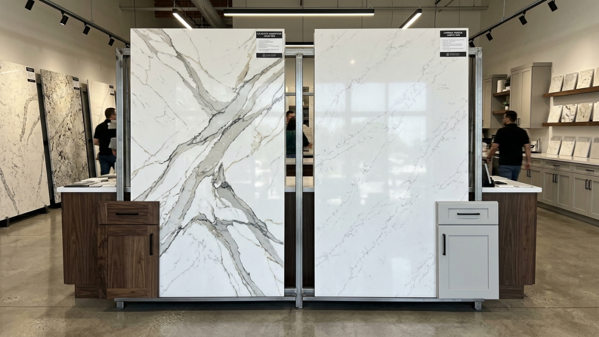
Definition: Veining density refers to how much pattern movement a quartz slab contains, from subtle speckling (low density) to dramatic, thick veins across the surface (bold density). Pattern scale describes the size and visual weight of those patterns.
The matching rule: If your quartz features bold, busy veining, pair it with simple cabinet designs to avoid overwhelming the space. Shaker fronts or flat panels let dramatic stone breathe. With more subtle quartz patterns, you have room to experiment with more detailed cabinet profiles, like raised panels or decorative molding.
Bold, high contrast veining is a defining trend in 2025 and 2026 kitchens, transforming countertops into statement pieces. Designers are using these striking patterns as visual anchors, pairing them with minimalist cabinetry and open shelving to keep the room from feeling chaotic.
The important thing to understand: two bold surfaces fight each other. Quartz with heavy veining and a patterned tile backsplash compete for the same visual attention. One should lead, the other should support. This principle applies to cabinets too.
Note that veining options differ depending on whether you choose prefab or slab quartz. Slab quartz generally offers a wider range of dramatic veining patterns, while prefab pieces come in more standardized designs.
Contrast vs. Coordination
Definition: A high contrast pairing places visually different surfaces next to each other (dark cabinets, light countertop). A tonal or monochromatic pairing keeps surfaces within a few shades of the same color family.
When each works:
- High contrast creates energy and definition. Dark navy lower cabinets with white quartz countertops read as bold and contemporary. This approach works well in larger kitchens where the eye has room to move.
- Tonal coordination creates calm and sophistication. White cabinets with white veined quartz, or gray cabinets with soft gray quartz, produce a seamless, expansive feel. This works especially well in smaller kitchens.
The “too close” trap: When countertop, cabinet, and backsplash are all within a few shades of the same color without enough separation, the kitchen reads as flat. There’s no depth. Intentional contrast, even subtle contrast, creates visual architecture. A white cabinet with white quartz works beautifully, but only when the whites share undertones and the veining or a backsplash introduces enough variation to prevent the space from looking washed out.
Use a Backsplash or Hardware as a Bridge
Sometimes the quartz and cabinets are both exactly what you want, but they don’t quite connect. The undertones are close but not identical, or the contrast feels slightly off. This is where the backsplash and cabinet hardware come in, not as afterthoughts, but as intentional design bridges.
How Backsplashes Bridge the Gap
A backsplash sits right between the countertop and the upper cabinets, making it the natural place to introduce a color or texture that ties both surfaces together. Practitioners on Reddit report that choosing a backsplash tile with flecks or veining that picks up tones from both the quartz and the cabinet finish is one of the most effective ways to make an imperfect match look perfectly intentional.
For example, warm cream cabinets with a cool white quartz can feel slightly disconnected. A subway tile backsplash in a soft warm gray bridges the temperature gap, pulling cool from the quartz and warmth from the cabinets. The backsplash doesn’t need to be dramatic. Even a simple ceramic tile in the right neutral tone does the job.
A few practical rules:
- If the quartz has bold veining, keep the backsplash simple (solid color or small format tile).
- If the quartz is quiet, the backsplash can carry more pattern, like a herringbone or zellige tile.
- Match at least one color in the backsplash to the quartz veining. This creates a visual thread that connects the horizontal and vertical surfaces.
Busy countertops with busy backsplashes create visual chaos. One leads, the other supports.
How Hardware Acts as a Connector
Cabinet hardware is small, but it punches above its weight in tying a kitchen together. The finish of your pulls, knobs, and handles should echo something in the countertop or backsplash.
Gold or brass hardware picks up warm veining tones in quartz and reinforces the warmth of cream or oak cabinets. Brushed nickel or chrome hardware complements cool gray veining and pairs naturally with bright white or navy cabinets. Matte black hardware creates a grounding accent that works with both warm and cool schemes, especially when the quartz has charcoal veining.
One interior designer on YouTube walked through a navy cabinet kitchen where the quartz had subtle gold veining. The client initially chose chrome hardware, and everything felt cold. Swapping to brushed brass pulls instantly connected the hardware to the quartz veining and warmed up the entire room. Small change, big impact.
The key is to think of hardware as a color echo. It doesn’t need to be the star. It just needs to repeat a tone that already exists somewhere in the room.
If you’re planning a full kitchen remodel and want to coordinate all of these elements on a timeline, this kitchen remodel checklist breaks the process into phases.
Pick Quartz First: The Decision Sequence
This might be the most counterintuitive piece of advice in the guide, but multiple designers and industry sources agree on it: choose your quartz countertop before your cabinets.
Why? Quartz comes in a wide range of colors and patterns, and its surface is consistent enough that you can predict exactly how it will read once installed. Cabinet paint, on the other hand, can be mixed to nearly any shade. Starting with the countertop and building outward prevents a common problem: choosing cabinets first and then trying to force a quartz into the remaining options, which often produces a result that feels compromised.
This approach is especially useful for homeowners keeping existing cabinets (more on the oak cabinet situation below). Even if your cabinets are fixed, picking the quartz thoughtfully, with your cabinet’s undertone in hand, produces better results than trying to match on memory alone.
Cabinet Style Pairings
Cabinet style affects matching just as much as color. The profile of the door, the presence or absence of a frame, and the level of surface detail all interact with whatever quartz pattern sits beside them.
Shaker Cabinets
Shaker cabinets remain one of the most versatile choices for pairing with quartz. Their simple, clean lines allow the beauty of the countertop to take center stage. White or light gray shaker cabinets paired with marble look quartz create a bright, elegant space. Darker shaker finishes (navy, charcoal, forest green) introduce modern sophistication while still letting the quartz do its job.
If you’re considering framed shaker cabinets, know that the recessed center panel adds just enough texture to complement moderate veining without competing with it.
Frameless and Flat Panel Cabinets
Flat panel, frameless cabinets complement a sleek, minimalist aesthetic. The smooth, unembellished surfaces pair naturally with clean quartz, particularly in kitchens with modern or Scandinavian influence. European flat panel cabinets in warm oak tones blend minimalist design with natural warmth, and light gray veined quartz countertops complete an elegant, understated look.
This cabinet style is underserved in most pairing guides, but it’s growing fast. If you’re curious about the structural and aesthetic differences, see this comparison of framed vs. frameless cabinets.
Two Tone Cabinets
The two tone trend continues gaining momentum: darker cabinets below (navy, forest green, charcoal), lighter ones above (white, cream, light gray). When working with two tone cabinets, the quartz countertop serves as the unifying element. It needs to bridge the two cabinet colors without clashing with either.
The safest approach is choosing quartz with a neutral undertone that picks up at least one tone from each cabinet color. A soft white quartz with warm gray veining, for example, can connect white upper cabinets to charcoal lowers without tension. Adding a backsplash that echoes the quartz veining strengthens the bridge even further.
Raised Panel and Traditional Cabinets
Ornate cabinet profiles have more visual weight. They already carry decoration in the door itself, so the quartz should stay quieter. Low veining or solid color quartz in warm tones lets traditional cabinetry feel rich without tipping into visual overload.
The 5 Step Quartz Matching Process
Many homeowners jump directly into choosing colors. Designers usually follow a repeatable sequence instead.
Step 1: Determine cabinet undertones
Warm, cool, or neutral.
Step 2: Decide whether the countertop or cabinets should be the focal point
Only one should dominate.
Step 3: Choose your desired contrast
High contrast, soft contrast, or monochromatic.
Step 4: Match the countertop pattern scale
Heavy veining, medium movement, or minimal movement.
Step 5: Verify under actual lighting
Morning, afternoon, and night.
Cabinet Color Pairings
White Cabinets
White cabinets are the most versatile starting point. They pair with virtually any quartz color, but “white” is not a monolith.
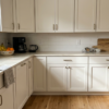
Warm white cabinets (cream, ivory, antique white) need quartz with warm undertones. Cool white cabinets (bright white, blue white) need quartz with cool or neutral undertones. Matching a cool white cabinet with a creamy quartz produces that nagging “something’s wrong” feeling.
For monochromatic designs, choose white quartz with similar undertones to your cabinets and let the veining provide visual interest. For contrast, select quartz with veining that incorporates accent colors (gold, charcoal, taupe) to create depth. For a deeper look at this specific pairing, see the full guide on quartz colors for white cabinets.
Gray Cabinets
Gray splits into two camps: warm greige (gray beige) and cool steel gray (blue gray). The distinction matters enormously.
Greige cabinets pair well with warm toned quartz, taupe veining, or soft beige backgrounds. Cool gray cabinets work with crisp white quartz or quartz with blue gray veining. Mixing the two temperature families creates the same clash described in the undertone section.
Wood and Oak Cabinets
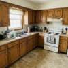
This is the highest anxiety pairing scenario on the internet. Practitioners on Houzz forums show oak cabinet owners agonizing over selections more than any other group. One user shared that while a certain stone was their favorite on its own, combined with the cabinet grain and flooring, it would be “way too busy,” and a simpler option would work better.
The most dependable approach: pick quartz that echoes the lightest tone in the wood grain rather than trying to match the darkest streaks. For honey oak, that usually means warm white or soft beige quartz. Avoid quartz with cool blue gray backgrounds when pairing with warm wood tones. The temperature clash is subtle but visible, especially across large surfaces.
Another common scenario from forums: homeowners want a countertop that works with their oak cabinets now but will also look good if they paint the cabinets later. The future proofing play is a warm neutral quartz (warm white with gentle veining, or soft greige). These tones complement natural oak and will still work after the cabinets get a coat of white or gray paint. Avoid anything too specifically matched to the orange gold of oak, because that pairing falls apart the moment the cabinets change color.
Dark Cabinets (Navy, Charcoal, Espresso)
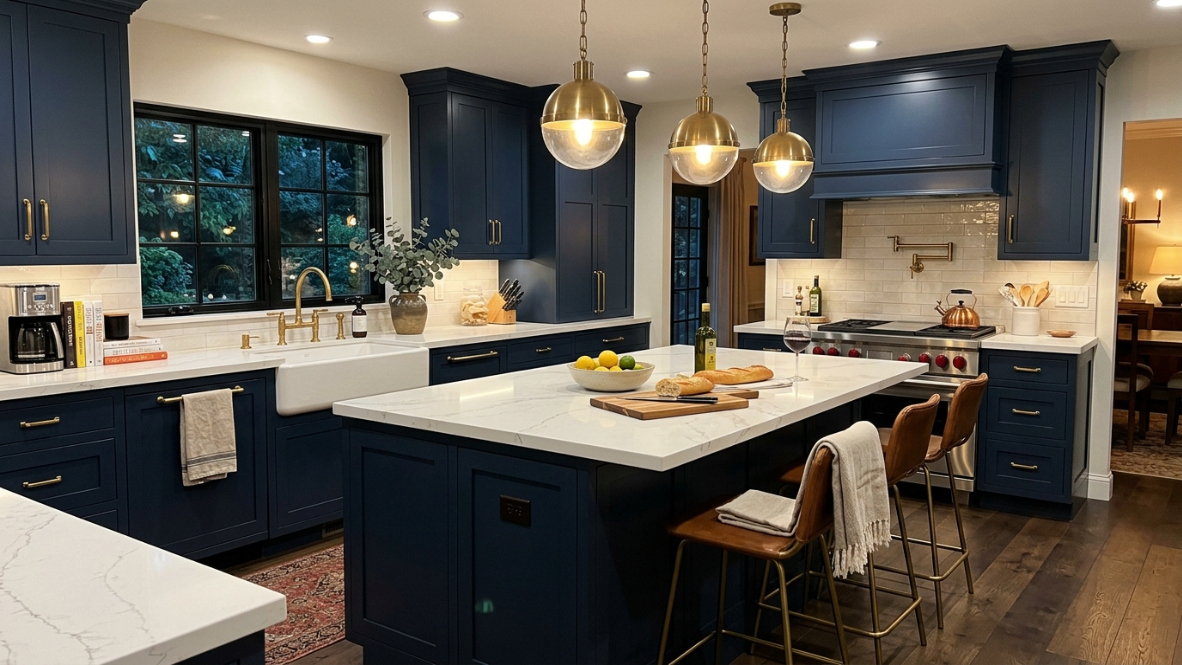
Colored cabinetry tends to work best when the quartz stays neutral. White quartz with clean veining provides contrast without competing. The risk with bold cabinets is choosing quartz that’s also bold. Two strong statements in the same sightline fight each other. Let the cabinets carry the personality and let the countertop stay grounded.
For espresso or dark walnut cabinets, quartz with warm white backgrounds and subtle gold or brown veining creates connection. For navy or charcoal, cool white or soft gray quartz with minimal veining keeps the focus on the cabinet color. When the quartz and cabinet don’t quite click, a carefully chosen hardware finish (brass for warm, nickel for cool) can close the gap.
Colored and Bold Cabinets (Sage, Terracotta, Teal)
Sage green and earthy tones are trending heavily in 2025 and 2026, especially on shaker doors. The same principle applies: let the quartz recede. A simple white or soft cream quartz with light veining allows a sage or terracotta cabinet to shine without visual competition.
See real cabinet installations for examples of how these pairings look in finished kitchens.
Common Quartz and Cabinet Matching Mistakes
Avoid these common design mistakes:
Matching only the main color
Always compare undertones, not just the visible color.
Using multiple bold patterns
Bold quartz plus a patterned backsplash plus ornate cabinets creates visual clutter.
Ignoring natural light
North facing kitchens make colors appear cooler. South facing kitchens make colors appear warmer.
Buying from small samples
Always view a full slab if possible. Quartz patterns often look dramatically different across larger surfaces.
Forgetting existing fixed elements
Your flooring, wall color, appliances, and lighting should influence countertop selection. If your kitchen floor is warm toned wood, jumping to a cool gray quartz without checking the full room palette is one of the most common remodel mistakes to avoid.
Treating backsplash and hardware as afterthoughts
These elements are not decorative extras. They are functional design connectors. Choosing them last, without considering how they relate to the quartz and cabinets, leaves visual gaps that make the whole kitchen feel slightly off. Plan them as part of the palette from the beginning.
Finish Matching: Glossy vs. Matte
Definition: Cabinet finish (glossy, satin, matte) and quartz finish (polished, honed, leathered) each carry their own visual texture. Pairing them thoughtfully creates harmony.
Glossy cabinet finishes reflect light and feel modern. They pair naturally with polished quartz surfaces, where both materials share a similar sheen. The result is bright and contemporary.
Matte cabinet finishes offer a softer, more tactile quality. They work beautifully with honed or textured quartz surfaces, creating a kitchen that feels warm and organic. The warm minimalism trend leans heavily into this combination: matte wood toned cabinets with honed quartz that mimics natural stone.
Mixing finishes (glossy cabinets with honed quartz, or matte cabinets with polished quartz) can work, but do it intentionally. The contrast should feel deliberate, not accidental.
Coordinate Quartz With Flooring and Backsplash
Many homeowners focus only on cabinets and countertops, but flooring and backsplashes determine whether the entire kitchen feels cohesive.
General rules:
- Warm wood flooring pairs best with warm quartz.
- Cool gray flooring pairs best with cool quartz.
- Busy countertops should have simple backsplashes.
- Dramatic backsplashes should use quieter quartz.
Think of your kitchen as one color palette instead of separate materials. If you’re also choosing new flooring, understanding options like waterproof kitchen flooring helps ensure your floor works with the countertop and cabinets as a unified scheme.
The Sample Test
Showroom lighting lies. Not maliciously, but fluorescent or LED showroom lights render color differently than your kitchen’s mix of natural daylight, recessed LEDs, and under cabinet task lighting. As designer Jennifer Foresman has noted, people often fall in love with colors they see on Pinterest and Houzz, but once it’s home, it’s nothing like they imagined.
Step by step protocol:
- Bring a cabinet door to the countertop showroom, or take quartz samples home. Many suppliers offer sample chips or small pieces for this purpose.
- Set samples vertically, not flat on a counter. This mimics how you’ll actually experience the pairing: your eye hits the cabinet face at roughly eye level and the countertop at waist height.
- Check in three lighting conditions: morning daylight, afternoon sun, and evening artificial light. Colors shift across all three.
- Look for undertone conflicts under each condition. A pairing that looks fine in daylight may reveal a yellow vs. blue clash under warm evening bulbs.
- Photograph with your phone’s flash off. Flash distorts color. Use natural or ambient light for photos you’ll reference later.
- Test hardware samples at the same time. Hold a brass pull against the quartz veining. Try a nickel knob next to the cabinet door. This is the fastest way to confirm whether your hardware choice bridges the countertop and cabinets or creates a third competing element.
If you’re in Washington State, Krafter’s Land offers free design consultations and showroom demos where you can test pairings in person.
Request a free design consultation to get professional help matching your specific cabinet and quartz selections.
Quick Reference Pairing Chart
This chart covers the most common cabinet colors and gives you a starting point, a safe quartz direction, and a pitfall to avoid. Bookmark it or screenshot it for the showroom.
| Cabinet Color | Best Quartz Direction | Watch Out For |
|---|---|---|
| Warm White / Cream | Warm white quartz with gold or taupe veining | Cool blue white quartz clashing with cream undertones |
| Cool / Bright White | Crisp white quartz with gray or charcoal veining | Creamy or yellow toned quartz looking dingy next to bright white |
| Light Gray | Soft gray quartz or white quartz with gray veining | Too close gray tones creating a flat, washed out look |
| Greige (Warm Gray) | Warm beige quartz or white quartz with taupe veining | Cool blue gray quartz creating temperature conflict |
| Honey Oak / Natural Wood | Warm white or soft beige quartz with minimal pattern | Cool blue gray backgrounds amplifying the orange in oak |
| Dark Walnut / Espresso | Warm white quartz with gold or brown veining | Dark quartz making the kitchen feel heavy and closed in |
| Navy Blue | Clean white quartz with subtle gray veining | Bold multi color veining competing with the cabinet color |
| Charcoal / Black | White or light gray quartz for maximum contrast | Matching dark on dark unless the kitchen is very large and well lit |
| Sage Green | Warm white or cream quartz with soft veining | Bold veining that overwhelms the muted cabinet color |
| Two Tone (Dark Lower / Light Upper) | Neutral undertone quartz that bridges both cabinet colors | Quartz that matches one cabinet color but clashes with the other |
2025 and 2026 Trend Context
Three trends are shaping how people match quartz countertops with cabinets right now.
Warm minimalism has replaced the cool gray kitchens that dominated the past decade. Warm whites, soft beiges, taupes, and earthy greiges define the neutral countertop palette. These nature inspired tones pair with honey, walnut, and oak cabinet finishes for kitchens that feel cozy without being cluttered.
Bold veining as a focal point is defining higher end kitchens. Thick, high contrast veins in gold, charcoal, or deep brown turn a countertop into the room’s centerpiece. The pairing rule stays firm: bold stone needs quiet cabinets. Flat panel or simple shaker doors work best.
Expanded cabinet color palettes on shaker doors, from calming sage green to rich navy and earthy toffee, are giving homeowners more personality options. Each of these colors works best when the quartz countertop takes a supporting role. Hardware and backsplash selections become even more critical with colored cabinets because they serve as the connective tissue between a bold cabinet and a neutral countertop.
Resale Value Considerations
Matching quartz countertops with cabinets isn’t just an aesthetic exercise. It affects what your home is worth.
Countertop upgrades typically recoup 85 to 93 percent of their cost at resale, with premium markets sometimes exceeding 100 percent. Market data shows 68 percent of buyers specifically seek quartz countertops when shopping for homes. The National Kitchen & Bath Association reports that 78 percent of design professionals expect quartz to remain the preferred countertop material for the foreseeable future.
The resale safe play: white quartz with white or wood cabinets. Case studies consistently show that homes with this combination sell faster and often at higher price points than those with more niche color choices. It provides a neutral canvas that appeals to the broadest range of buyers.
Quartz prices generally range from $60 to $150 per square foot. For a comparison with other materials, see how quartz stacks up against marble in terms of cost, maintenance, and longevity.
Best Quartz Countertop Colors for Every Kitchen Style
| Kitchen Style | Best Quartz |
|---|---|
| Modern | White with subtle gray veining |
| Scandinavian | Soft white matte quartz |
| Farmhouse | Warm white with light movement |
| Transitional | Marble look quartz |
| Contemporary | White waterfall quartz |
| Traditional | Cream quartz with subtle veining |
| Minimalist | Solid white quartz |
| Luxury | Bold Calacatta look quartz |
Designer Checklist Before Ordering Quartz
✔ Cabinet samples tested in natural light
✔ Flooring considered
✔ Backsplash selected (and verified as a bridge between countertop and cabinets)
✔ Hardware finish chosen (echoing a tone in the quartz or backsplash)
✔ Sink color coordinated
✔ Edge profile selected
✔ Full slab viewed
✔ Veining direction approved
✔ Lighting plan finalized
Quartz Countertops by Cabinet Wood Species
Oak Cabinets
Best:
- Warm white
- Beige
- Cream
Avoid:
- Blue gray quartz
Maple Cabinets
Best:
- Bright white
- Light gray
- Soft marble look
Walnut Cabinets
Best:
- White quartz
- Warm veining
- Light greige
Cherry Cabinets
Best:
- Ivory
- Warm white
- Beige
Hickory Cabinets
Best:
- Low movement quartz
Avoid:
- Busy veining (hickory’s natural grain variation already provides plenty of visual movement, so adding bold quartz veining creates two competing textures)
Frequently Asked Questions
Should I pick quartz countertops or cabinets first?
Pick the quartz first. Quartz comes in a fixed range of colors and patterns, and what you see on the slab is what you get. Cabinet paint can be mixed to nearly any shade, making it easier to adjust cabinets to match a countertop than the other way around. Starting with cabinets and then trying to find quartz that fits often produces forced, unsatisfying results.
What quartz color works best with honey oak cabinets?
Warm white or soft beige quartz with minimal busy patterning. The key is picking up the lightest tone in the wood grain rather than matching its darkest streaks. Avoid cool blue gray quartz backgrounds, because the temperature clash with warm oak is subtle but consistently visible across a full countertop.
Can you match quartz countertops with two tone cabinets?
Yes, and the quartz actually becomes the most important element in the room. It needs to bridge the two cabinet colors. Choose a neutral undertone quartz that shares at least one tone with each cabinet color. A warm white quartz with gentle gray veining, for example, can connect white upper cabinets with charcoal lower cabinets.
Why do my white quartz and white cabinets look mismatched?
Almost certainly an undertone conflict. One surface has a warm (cream, yellow) undertone while the other has a cool (blue, gray) undertone. They’re both “white,” but they’re not the same white. Hold them side by side in natural daylight to spot the difference. If the gap is small, a backsplash or hardware finish that shares tones with both surfaces can soften the mismatch.
Does quartz with bold veining work in any kitchen?
It can, but bold veining demands simple surroundings. Pair it with flat panel or basic shaker cabinets and a restrained backsplash. If the cabinets have ornate detailing or the backsplash has its own strong pattern, the kitchen will feel visually chaotic. One surface leads, the rest support.
What quartz pairs best with dark navy cabinets?
Clean white quartz with subtle gray veining. The goal is contrast without competition. Navy cabinets are already a strong design statement. Adding bold or multi colored quartz veining creates two focal points fighting for attention, which dilutes the impact of both.
How do I test quartz and cabinet samples at home?
Bring samples into your kitchen and hold them vertically next to each other, since that mimics how you’ll actually see them once installed. Check the pairing in morning daylight, afternoon sun, and evening artificial light. Photograph without flash. Colors shift dramatically across different lighting conditions, and what looks perfect at the showroom may reveal conflicts at home. Test your hardware samples at the same time to confirm the metal finish ties everything together.
Does matching quartz countertops with cabinets affect resale value?
Significantly. Neutral pairings (white quartz with white or wood cabinets) appeal to the broadest buyer pool and tend to sell faster at higher prices. Quartz countertop upgrades recoup 85 to 93 percent of their cost, but that return depends partly on the pairing looking cohesive and broadly appealing rather than highly personalized.
Can a backsplash fix a bad quartz and cabinet match?
Not always, but it can bridge a near miss. If the undertones of your quartz and cabinets are only slightly off, a backsplash tile that picks up a color from each surface can create visual cohesion. The backsplash won’t fix a fundamentally clashing pairing (like warm orange oak with icy blue gray quartz), but it’s surprisingly effective at softening minor temperature differences.
What hardware finish works with most quartz and cabinet combinations?
Brushed nickel is the safest all rounder because it reads as neutral and doesn’t compete with most quartz veining. That said, brass and gold finishes are better at warming up a cool toned kitchen, and matte black works well as a grounding accent in both warm and cool schemes. The best approach is to match the hardware to a secondary tone in the quartz veining rather than choosing hardware in isolation.
Ready to see these pairings in person? Visit a Krafter’s Land showroom in Tukwila, Tacoma, Lynnwood, or Spokane to test quartz and cabinet combinations under real lighting with free design support.