TL;DR
Cabinet color project photos are most useful when they show full room context, not just a close-up swatch. This guide covers warm white through eggplant, with notes on best applications, pairings, maintenance, and resale value for each color. White still leads at 46% of kitchens, but natural wood, sage, navy, and charcoal are gaining ground fast. Newer entries like terracotta, teal, pink, and color-blocked combinations are showing up in designer portfolios and on social media, though they carry more risk if you plan to sell your home. Whether you’re planning a full remodel or just looking for ideas, this resource will help you pick a cabinet color you’ll love for years.
Quick Answer: What Are the Best Cabinet Colors for 2026?
The best cabinet colors for 2026 include warm white, cream, greige, natural wood, sage green, deep green, navy blue, dusty blue, charcoal, walnut, two-tone combinations, and muted plum or clay accents. Emerging options like teal, terracotta, lilac, and color-blocked designs are gaining traction on design platforms. Warm neutrals and natural wood offer the broadest appeal, while green, blue, and darker shades add personality for homeowners who want more character. To find the right color for your kitchen, compare cabinet color project photos with similar lighting, countertops, flooring, door styles, and hardware to your own space. Always view physical samples in your actual kitchen before making a final decision.
How to Read Cabinet Color Project Photos Before You Commit
A cabinet sample chip and a finished kitchen are two different things. The same sage green can look fresh and earthy in a south-facing room with warm oak floors, then turn flat and gray in a north-facing kitchen under cool LED bulbs. Homeowners on Houzz report this exact problem: one user painting lower cabinets sage found the color shifted gray and blue in north-facing light, while a navy cabinet thread showed Hale Navy reading gray or washed out under certain fixtures.
That means browsing cabinet color project photos without context leads to disappointment. When you’re saving inspiration photos, every project image should tell you something about these factors:
- Cabinet door style. Slab doors read modern. Shaker reads transitional. A Slim Shaker profile bridges both. The door profile changes how light hits the surface, which changes how the color appears.
- Natural light direction. North-facing rooms cool down warm colors. South-facing rooms warm them up. Pay attention to which direction your kitchen windows face before falling in love with a color you saw in someone else’s sun-drenched space.
- Artificial light temperature. Warm bulbs (2700K) push colors toward yellow. Cool bulbs (4000K+) push them toward blue.
- Countertop and backsplash. A busy veined quartz next to a bold cabinet color creates visual competition. A simple white slab lets the cabinet color breathe. For deeper guidance on coordinating these materials, see this countertop and cabinet matching guide.
- Flooring undertone. Warm oak floors fight cool gray cabinets. Cool gray tile fights creamy cabinets.
- Finish type. Was the cabinet factory painted, professionally sprayed on site, brushed by a homeowner, stained, or laminate? This affects how the color looks and how it holds up, and it’s one of the first things to figure out when you’re comparing inspiration photos to your own project.
The goal isn’t to find the prettiest photo online. It’s to find a photo where the room conditions match your kitchen closely enough to predict the outcome. This is also where working with a good designer or contractor adds real value: they can translate a Pinterest save into a buildable, livable kitchen.
Visit a showroom near you to compare sample doors against real countertop and flooring materials before placing orders.
Cabinet Color Ideas Compared: Best Uses and Pairings
| Cabinet color | Best for | Visual effect | Maintenance consideration | Suggested pairings |
|---|---|---|---|---|
| Warm white | Small kitchens, rental units, resale-focused projects | Bright and versatile | Smudges and chips can stand out | Warm quartz, oak, brass |
| Cream or off white | Traditional and cottage kitchens | Soft and welcoming | Can show dirt; undertones need coordination | Cream stone, brass, natural wood |
| Greige, taupe, or mushroom | Transitional kitchens | Calm and understated | Mid tones can hide everyday marks better than white | Bronze, warm quartz, medium wood |
| Natural wood or white oak | Family kitchens, organic modern designs | Warm and textured | Depends on stain, grain, and protective finish | White quartz, black accents |
| Sage green | Cottage, farmhouse, and transitional kitchens | Muted and nature inspired | Undertones change with lighting | Cream, brass, light oak |
| Olive or deep green | Statement islands, pantries, traditional kitchens | Rich and grounded | Dust and finish flaws can be noticeable | Soapstone, walnut, brass |
| Emerald green | Bold accent islands, formal kitchens | Jewel toned and dramatic | Shows fingerprints and dust readily | White marble, gold hardware |
| Teal | Eclectic, coastal modern, and creative kitchens | Vibrant and energetic | Needs careful undertone pairing | Warm wood, cream counters, brass |
| Navy blue | Islands and lower cabinets | Classic and polished | Dark finishes can show dust and fingerprints | White perimeter cabinets, brass |
| Dusty blue or blue gray | Coastal and cottage kitchens | Soft and airy | Can look cold under cool lighting | White tile, light wood, nickel |
| Charcoal or matte black | Modern and high contrast kitchens | Bold and architectural | Fingerprints, dust, and water spots may show | White quartz, warm wood |
| Black and white two tone | Contemporary kitchens with strong geometry | High contrast and graphic | Both extremes show marks | Warm wood flooring, brass or black hardware |
| Black and brown | Moody modern, organic luxe kitchens | Layered and warm | Requires good lighting to avoid cave effect | Cream stone, warm metals |
| Walnut, espresso, or dark brown | Midcentury and organic modern kitchens | Deep and warm | Depends on wood species and finish | Cream stone, bronze, white walls |
| Natural oak with light wash | Scandinavian, minimalist kitchens | Airy and organic | Gentle finish needs recoating over time | White quartz, matte black hardware |
| Two tone or colored island | Homeowners who want a controlled accent | Balanced with a focal point | Island surfaces receive frequent use | Neutral perimeter, contrasting island |
| Terracotta | Mediterranean, southwestern, earthy kitchens | Warm and textured | Bold warm tones can limit future flexibility | Natural stone, wrought iron, cream |
| Pink (blush or dusty rose) | Playful cottagecore, feminine modern spaces | Soft and unexpected | Trend risk is higher than neutrals | Marble, brass, warm gray |
| Lilac or lavender | Eclectic and whimsical kitchens | Airy and fresh | Narrow pairing window | White, light wood, silver hardware |
| Muted burgundy, plum, eggplant, or aubergine | Bars, pantries, and distinctive accent areas | Warm and expressive | Bold colors may limit some buyers’ preferences | Walnut, cream stone, brass |
| Yellow | Cheerful cottage or retro kitchens | Energetic and sunny | Ochre and mustard age better than bright yellow | White, natural wood, black accents |
| Red lacquer | Ultra modern, Asian inspired, statement kitchens | Glossy and commanding | Shows every fingerprint and scratch | White walls, stainless steel, dark flooring |
| Color blocked | Designer showpieces, creative remodels | Graphic and intentional | Requires precise execution | Depends on color pairing |
| Glass front with pastel backing | Transitional display cabinets, butler’s pantries | Light and curated | Glass fronts require tidy interiors | White or cream frames, simple hardware |
| Dark monochromatic (single dark tone floor to ceiling) | Large loft kitchens, dramatic open plans | Enveloping and moody | Every surface shows dust and marks | Metallic accents, dramatic lighting |
Cabinet Color Project Photo Ideas Worth Saving
1. Warm White Kitchen Cabinet Project Photos
Best for: Small kitchens, open-concept spaces, and homes where you want a bright, timeless look with broad buyer appeal.
Warm white cabinets create a bright foundation without the stark, clinical appearance that cooler whites can produce. When browsing cabinet color project photos, look for examples that pair warm white doors with natural wood floors, subtle countertop veining, or contrasting hardware. These details add depth and keep the kitchen from feeling flat. White Shaker remains the single most popular cabinet style for good reason: it works with almost everything.
Best material and hardware pairings
- Cream or softly veined quartz countertops
- Oak or hickory flooring
- Brass, brushed gold, or matte black hardware
- Textured subway tile or natural stone backsplashes
Advantages and tradeoffs
Warm white works with many design styles and can make a compact kitchen feel brighter. However, grease marks, scuffs, and chips stand out, particularly on frequently touched areas like around handles and near the stove. Keep this in mind if you have young kids or heavy cooking habits. An all-white scheme can also lack personality if the countertops, backsplash, walls, and cabinets all match too closely.
How to find the right white
Compare your cabinet sample with the actual countertop and backsplash under both natural and artificial light. If your countertop has a cool white undertone, a strongly yellow-based cabinet color will look mismatched beside it. If your floors are honey oak, a warmer cabinet white creates a more cohesive palette. For more on pairing whites, see this guide on the best quartz colors for white cabinets.
What about cost?
Professional cabinet painting costs vary with kitchen size, cabinet condition, and how much prep work is involved. When comparing repainting to replacing, get itemized quotes that spell out surface preparation, primer, coating, removal, and reinstallation. Factory-finished white cabinets with consistent color and properly cured finishes often hold up better than field-painted results over time.
2. Cream or Off White
Best for: Traditional homes, cottage kitchens, and any kitchen where bright white feels too harsh against warm stone or flooring.
Cream sits between white and beige. It keeps a kitchen light while adding warmth, making it forgiving alongside honey-toned floors or tan granite that a cooler white would fight.
Works with:
- Marble-look quartz
- Brushed brass or antique brass hardware
- Natural wood shelving or a wood range hood
- Warm-toned porcelain tile backsplash
Tradeoffs:
- Cream can look yellow next to a cool white countertop.
- Paired with too much beige or tan, cream risks looking like a leftover from the 2000s.
- The undertone must coordinate with the backsplash and flooring.
Why it’s a safe pick: NKBA’s 2026 Kitchen Trends Report confirms neutrals remain the most popular color family, identified by 96% of survey respondents. Cream and off white sit in this sweet spot: neutral enough for broad appeal, warm enough to avoid the “hospital white” complaint that homeowners increasingly raise. If you’re planning to sell in the next few years, cream is one of the safest bets.
3. Greige, Taupe, or Mushroom
Best for: Transitional kitchens, homeowners tired of white but not ready for bold color, and rooms where existing finishes mix warm and cool tones.
Greige bridges gray and beige. Taupe and mushroom lean warmer. These mid-tone neutrals hide smudges better than white and create a calm, grounded feel, making them a strong choice for families with children.
Works with:
- Cream or warm white quartz
- Bronze or oil-rubbed hardware
- Medium-tone wood flooring
- Slab or Slim Shaker door styles
Tradeoffs:
- Greige can fall flat if every surrounding finish is also beige.
- In low light, taupe can look muddy.
- Needs contrast from either the countertop, backsplash, or hardware to avoid blandness.
Cost note: Specialty finishes like glazes or distressed treatments can add $500 to $2,000 to cabinet painting projects, according to Angi’s 2026 data. Factor in these extras if you want a custom look beyond a simple color change.
4. Natural Wood or White Oak
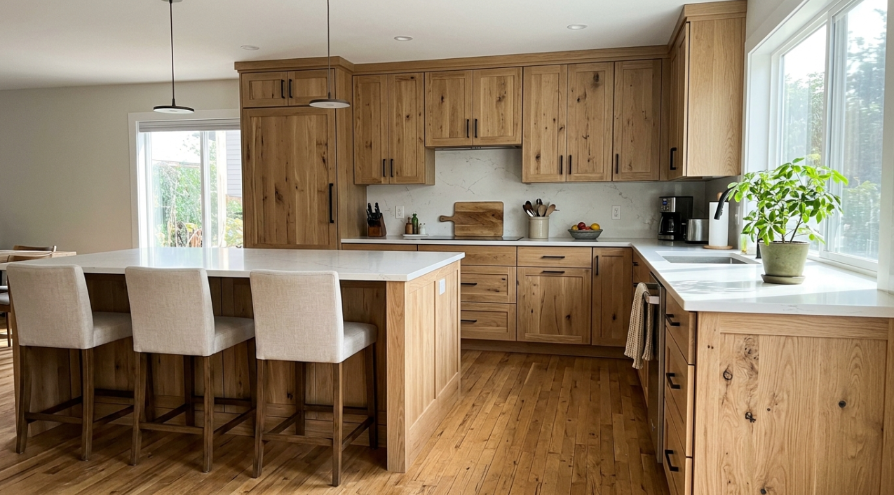
Best for: High-use family kitchens, organic modern designs, Scandinavian-inspired spaces, and homeowners concerned about paint chipping over time.
Wood is having a major resurgence. NKBA’s 2026 report found wood grain surpassed painted cabinets as a growing popularity trend, with white oak as the most popular wood type at 51%. If you’ve been assuming painted cabinets are the only modern option, it’s worth reconsidering natural wood.
Works with:
- White or light quartz countertops
- Black matte hardware
- Simple slab backsplash
- Frameless cabinet construction for a clean, modern look (learn the differences between framed and frameless builds)
Tradeoffs:
- Wood tone must coordinate with flooring. Two similar but not matching wood tones look accidental. This is one of the most common mistakes homeowners make, and it’s worth checking carefully during planning.
- Busy grain patterns can clash with veined countertops.
- Cheap wood-look laminates often photograph better than they look in person. Seeing samples in person at a showroom prevents this mismatch.
What homeowners say: Practitioners on Reddit comparing painted vs. stained cabinets generally agree that stain or natural wood wears better than paint, especially in homes with kids, dogs, and heavy cooking. One r/kitchenremodel commenter noted that stained surfaces handle daily abuse without showing the chips and rubs that plague painted finishes. If durability is a top concern, natural wood deserves a close look.
For more on this trend, see this guide to natural Shaker cabinets.
5. Natural Oak with Light Wash
Best for: Minimalist kitchens, Scandinavian designs, and homeowners who want the warmth of wood with a lighter, more contemporary feel than traditional oak stain.
A light-washed oak cabinet sits between raw natural wood and a painted finish. The wash lets grain show through while softening the orange and amber tones that turn some people away from traditional oak. This look has gained traction as the “blonde wood” aesthetic spreads from furniture design into kitchen cabinetry.
Works with:
- White quartz or concrete-look countertops
- Matte black or brushed nickel hardware
- White or light gray walls
- SPC or light tile flooring
Tradeoffs:
- The light wash can wear unevenly in high-traffic areas, requiring periodic recoating.
- If the wash is too subtle, it may read as unfinished rather than intentional.
- Coordinating with other wood tones in the room demands attention; two different “light” woods can clash.
Tip: Request a sample door with the specific wash applied. Photos of light-washed oak vary wildly depending on the brand and application method. What looks airy on screen can look pink or yellow in your kitchen light. Seeing a physical sample in your actual space eliminates the guesswork.
6. Sage Green
Best for: Homeowners who want color without drama. Works in transitional, cottage, farmhouse, and organic modern kitchens, plus bathroom vanities and laundry rooms.
Sage has become the go-to “first color” choice for people stepping away from white. Zillow’s 2026 paint color analysis found sage green ranked in the top tier across every room studied. It’s popular for a reason: it’s warm, natural, and pairs easily with common kitchen materials.
Works with:
- Cream or warm white quartz
- Brass or brushed gold hardware
- Light oak or white oak flooring
- Simple white subway tile
Tradeoffs:
- Sage turns gray in north-facing kitchens and under cool LED lighting. Multiple homeowners on Houzz have documented this problem. Check which direction your kitchen windows face before committing.
- Blue-leaning sage clashes with warm oak floors. Yellow-green or olive-leaning sage works better with warm wood.
- As sage’s popularity grows, there is a future trend fatigue risk.
Color expert insight: Color strategist Sarah Fishburne notes that sage and olive are doing different jobs. Sage has taken over kitchen and bath cabinets, while olive appears in richer, more grounded applications. She emphasizes that green undertones can lean cool or warm, which matters more than most people realize. This is why seeing physical samples in your actual kitchen light is so important.
Tip: Never approve sage from a paint chip alone. Paint a sample board or get a sample door and hold it against your actual countertop in your kitchen light, both morning and evening.
Request a free design and quote to compare sage cabinet samples with countertop, flooring, and tile selections before making your decision.
7. Olive or Deep Green
Best for: Historic homes, butler’s pantries, wet bars, statement islands, and homeowners who want richness without going black.
Deep green carries weight and sophistication. NKBA’s 2025 report identified green as the most popular color for that year, with 76% of respondents selecting it.
Works with:
- Marble-look or soapstone-look countertops
- Unlacquered brass or aged bronze hardware
- Walnut or dark wood accents
- Minimal backsplash patterns
Tradeoffs:
- Saturated greens expose finish inconsistencies. A renovation practitioner on LinkedIn warns that deep green and navy cabinetry reveal every imperfection in finish quality, especially under north-facing light. Factory-finished cabinets handle saturated colors more consistently than field-painted work.
- Dark green absorbs light. If your kitchen has limited natural light, plan for under-cabinet LED strips to keep countertops usable.
- A full deep green kitchen is more polarizing than using green on an island alone. If resale matters to you, the island-only approach is safer.
Word of caution on DIY: When homeowners try painting existing cabinets deep green, poor prep will ruin the look. Reddit’s r/HomeImprovement threads repeatedly cite chipping, rubbing at high-touch points, and peeling where prep or product choice was weak. For saturated colors like deep green, factory-finished cabinets produce a more consistent and durable result.
8. Emerald Green
Best for: Homeowners who want a jewel-toned statement that goes beyond the subtlety of sage or olive. Works on islands, accent walls of cabinetry, or full kitchens in well-lit spaces.
Emerald is bolder and more saturated than sage or olive. It reads as intentionally glamorous rather than organic. Think of it as the difference between a linen shirt and a velvet blazer.
Works with:
- White marble or marble-look quartz countertops
- Gold or brushed brass hardware
- Dark wood flooring
- Simple white or cream backsplash to let the green command attention
Tradeoffs:
- Emerald is highly sensitive to lighting. Under warm bulbs it glows. Under cool LEDs it can turn almost teal.
- Fingerprints, water spots, and dust are visible on dark saturated surfaces.
- Resale appeal is narrower than sage or olive. Best for homeowners who plan to stay long-term, or confined to an island or pantry.
Tip: Emerald works best when it’s the single star of the room. Keep everything else quiet: simple countertop, minimal backsplash, restrained hardware. Two bold elements next to emerald creates noise.
9. Teal
Best for: Eclectic kitchens, coastal modern spaces, and homeowners who find navy too conservative and green too common.
Teal sits at the intersection of blue and green, which gives it a chameleon quality. It can read as sophisticated or playful depending on the surrounding materials. Practitioners on design forums note that teal is one of the hardest cabinet colors to photograph accurately, meaning what you see in cabinet color project photos online may not match reality. Physical samples are essential for this color.
Works with:
- Warm wood countertops or light butcher block
- Cream or warm white quartz
- Brass hardware (gold tones complement teal’s warmth)
- Terracotta or warm tile flooring
Tradeoffs:
- Teal has a narrow pairing window. Cool gray countertops or flooring can make it look disjointed.
- It reads differently under every light temperature. Test extensively before ordering.
- Full teal kitchens are polarizing. An island or lower cabinet application is the safer approach.
10. Navy Blue
Best for: Islands, lower cabinets, coastal kitchens, and traditional or transitional designs where you want color with classic roots.
Navy has been the go-to “safe bold” for several years. The Houzz 2024 study found blue remained a top contrasting island cabinet color at 25%.
Works with:
- White or cream perimeter cabinets
- White quartz countertops
- Brass hardware (warms the palette)
- Warm wood flooring
Tradeoffs:
- Some navies shift toward gray, purple, or washed-out blue under certain lighting. One Houzz user found Hale Navy looked gray under strong light and later preferred Sherwin Williams Naval, after testing multiple conditions. This is why sample doors matter so much.
- Full navy kitchens can feel heavy in small, low-light rooms.
- Matte navy shows fingerprints and dust more than satin finishes.
Tip: Navy works best with restraint. Use it on lower cabinets or the island, keeping uppers white or wood. This preserves lightness while adding personality, and it’s the easiest way to introduce color without a huge commitment.
11. Dusty Blue or Blue Gray
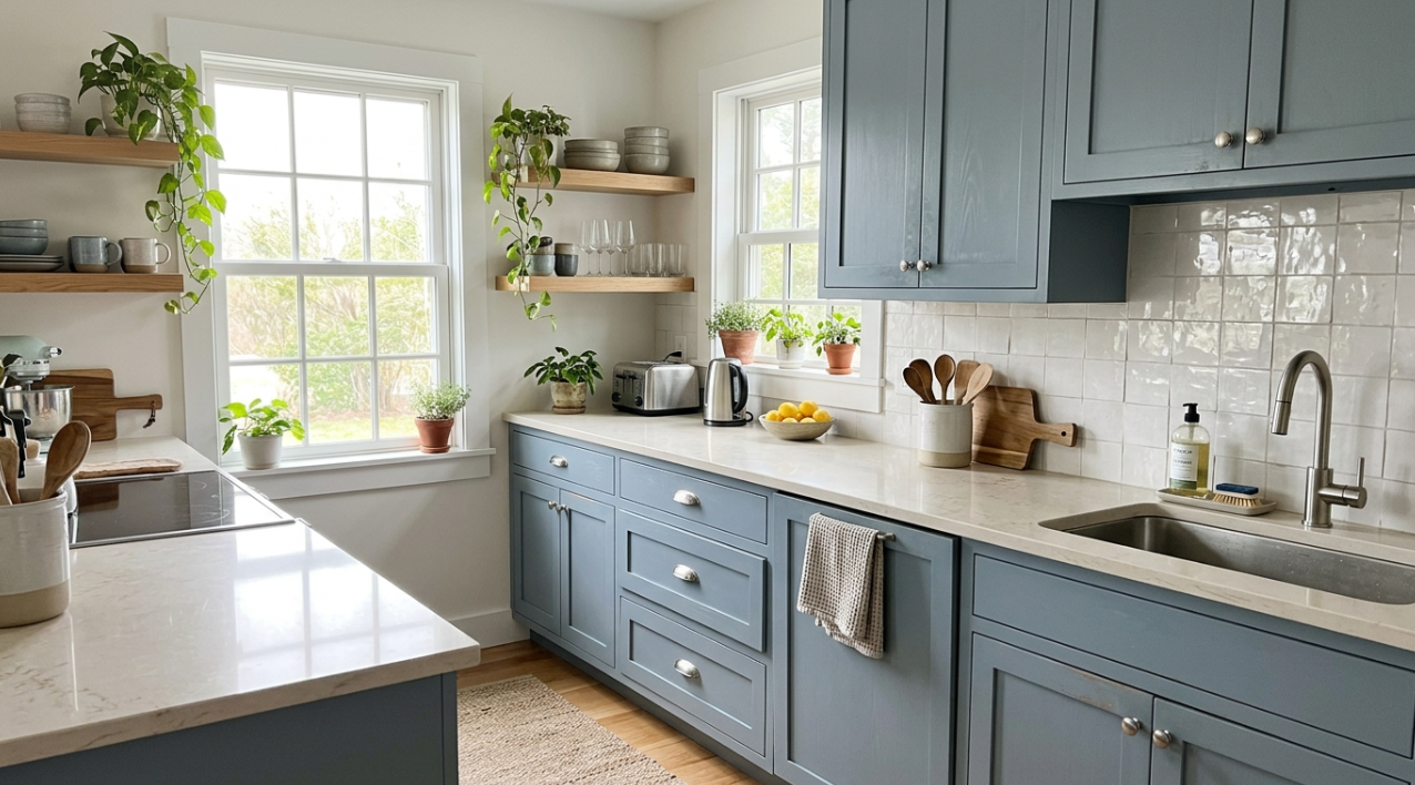
Best for: Coastal homes, cottage kitchens, secondary kitchens, laundry rooms, and spaces where navy feels too heavy.
Dusty blue delivers color without high contrast. It’s airy and soft, which makes it a good fit for smaller rooms.
Works with:
- Gray-white quartz
- Brushed nickel or polished nickel hardware
- White tile backsplash
- Light wood or white-washed flooring
Tradeoffs:
- Blue gray can look cold and lifeless in rooms without natural light.
- Too much gray undertone can push the look toward “dated gray kitchen.”
- Blue can shift purple or green depending on neighboring finishes. Homeowners on Houzz looking for blue cabinets repeatedly emphasize the importance of undertone control.
Cost note: If you want a custom blue that isn’t a standard factory finish, expect upcharges, longer lead times, and more difficult future touch-up matching. Choosing from a supplier’s standard color line streamlines your project and keeps costs down.
12. Ocean Blue Lower Cabinet
Best for: Homeowners who want a bolder blue than dusty or navy, applied strategically on lower cabinets only.
Ocean blue is brighter and more saturated than navy, sitting closer to a true medium blue. It creates an anchor at the base of the kitchen while lighter upper cabinets (or open shelving) keep the room from feeling enclosed.
Works with:
- White or very light upper cabinets
- White quartz or marble-look countertops
- Brushed gold or matte black hardware
- Light wood or white tile flooring
Tradeoffs:
- Ocean blue on all cabinets can overwhelm a room. Lower cabinet or island-only applications control the impact.
- The color reads dramatically different in warm vs. cool lighting, sometimes appearing almost purple.
- Touch-ups on vivid blues are difficult to match, making factory-finished cabinets the stronger choice for this color.
13. Charcoal or Matte Black
Best for: Modern kitchens, high-contrast designs, large rooms with strong natural light, and homeowners who want an architectural statement.
Dark cabinets perform better in resale than many people expect. Zillow’s 2026 analysis found charcoal gray kitchens associated with offers +$1,373 above comparable homes, while white kitchens were associated with slightly lower offers. So if you’ve been holding back on dark colors because of resale concerns, the data says you have more room than you think.
Works with:
- White quartz countertops (for contrast)
- Warm wood flooring
- Slab or Slim Shaker doors
- Integrated or minimal hardware
Tradeoffs:
- Shows dust, water spots, and fingerprints constantly. Be honest with yourself about how much wiping you’re willing to do.
- Needs strong task lighting and under-cabinet lighting. Homeowners on Houzz warn that dark-on-dark combinations can make countertop surfaces hard to work on without a proper lighting plan.
- Poor finish quality is more visible on dark surfaces than on lighter ones. Factory-finished cabinets are strongly recommended for charcoal and black.
Tip: Dark cabinets are not a mistake. Dark cabinets without a lighting plan are the mistake. Include under-cabinet LEDs, pendant lighting over the island, and enough recessed lights to keep countertops workable. Plan for lighting from the start and you’ll love the result.
14. Dark Monochromatic (Single Dark Tone, Floor to Ceiling)
Best for: Large, well-lit kitchens where you want a dramatic, enveloping feel. Loft conversions, open-plan living spaces, and high-end modern homes.
A dark monochromatic kitchen uses one dark color (charcoal, deep navy, forest green, or matte black) across all cabinets, sometimes extending to walls and even the ceiling. The effect is theatrical. When done well, it makes the kitchen feel like a single sculpted object.
Works with:
- Metallic accents (brass, copper, or stainless) to break the monotone
- A single contrasting material like a white marble countertop or a light wood shelf
- Dramatic pendant lighting that becomes the focal point
- Large-format flooring that minimizes visual breaks
Tradeoffs:
- Every surface shows dust, crumbs, water spots, and fingerprints.
- Without enough natural light or thoughtful artificial lighting, the room will feel like a cave.
- Small kitchens cannot pull this off. The room needs physical volume to absorb the darkness without feeling claustrophobic.
- Resale risk is high. Most buyers do not want an all-dark kitchen. Be honest about whether this is your forever home.
15. Black and White Two Tone
Best for: Contemporary kitchens where you want graphic, high-contrast energy without introducing color.
Black and white is the most classic two-tone combination. It works because the contrast is definitive: there is no ambiguity about whether the tones are coordinated.
Works with:
- Warm wood flooring to soften the contrast
- Brass or matte black hardware
- Simple countertops (busy veining competes with the strong cabinet contrast)
- Clean-lined door profiles (slab or slim shaker)
Tradeoffs:
- Both black and white show marks. White shows grease and yellowing. Black shows dust and water spots.
- The stark contrast can feel cold without a warming element like wood or brass.
- Requires disciplined styling. Clutter destroys the graphic effect.
16. Black and Brown
Best for: Moody modern kitchens, organic luxe designs, and homeowners who want depth without the starkness of black and white.
Pairing black cabinets with brown wood elements (a walnut island, open shelving, or wood range hood) creates a layered, warm atmosphere. The brown keeps the black from feeling sterile.
Works with:
- Cream or warm white stone countertops
- Warm metallic hardware (brass or bronze)
- Natural stone or textured tile backsplash
- Warm-toned waterproof kitchen flooring
Tradeoffs:
- The combination absorbs a lot of light. Kitchens with limited windows need substantial artificial lighting, which should be part of your plan from the start.
- The wood tone must be warm enough to contrast with the black. Cool-toned gray-brown wood next to black looks muddy.
- Both surfaces show dust, though the brown wood handles fingerprints better than matte black.
17. Walnut, Espresso, or Dark Brown
Best for: Midcentury-inspired kitchens, luxury remodels, and organic modern spaces where you want warmth and depth without painted color.
Brown is returning. NKBA’s 2025 report found 56% of respondents selected brown among prominent kitchen color choices, and the 2026 report reinforces wood grain’s rising popularity.
Works with:
- Cream or light stone countertops
- Bronze or brass hardware
- White walls for contrast
- Simple backsplash with minimal pattern
Tradeoffs:
- Dark brown paired with heavy granite and beige tile looks like a 2007 kitchen. Update the surrounding materials to keep it feeling current.
- Needs lighter countertops and walls for balance.
- Dark surfaces absorb light, so plan your fixtures accordingly.
Cost note: Refinishing or staining may work better than painting if your existing wood quality is high. For a breakdown of different project paths and their costs, this Washington cabinet cost breakdown provides useful planning ranges.
18. Terracotta
Best for: Mediterranean kitchens, southwestern designs, and homeowners drawn to earthy, warm color palettes.
Terracotta cabinets bring a sun-baked warmth that no cool tone can replicate. The color gained momentum through interior design social media, where European kitchen renovations featuring terracotta and clay tones consistently generate high engagement. It reads as grounded and organic rather than trendy.
Works with:
- Natural stone or concrete-look countertops
- Wrought iron or oil-rubbed bronze hardware
- Cream or off-white walls
- Terracotta or natural stone tile flooring (though matching floor and cabinet terracotta requires careful coordination to avoid looking monolithic)
Tradeoffs:
- Terracotta is a warm, orange-based color. Cool-toned rooms and cool lighting will fight it.
- It is not a neutral. Resale appeal is narrower than sage or white.
- Paired with too much wood, it can feel heavy. A white or cream countertop provides essential relief.
19. Two Tone or Colored Island
Best for: Homeowners who want personality but worry about committing to full-color cabinets. Also a great option if you want your kitchen to feel custom without the cost of an entirely bespoke project.
Two-tone kitchen cabinet project photos are among the most saved images on design platforms. The strategy is simple: keep perimeter cabinets neutral (white, cream, wood, or greige) and put the color on the island. This approach adds visual interest without the risk that comes with wrapping an entire kitchen in a bold shade.
Works with:
- Navy, green, black, or walnut island with white or wood perimeter
- Brass or black hardware tying the two zones together
- A countertop that works with both cabinet tones
Tradeoffs:
- More than two finishes can look chaotic.
- The island color must relate to something else in the room (a backsplash accent, stool upholstery, or hardware finish).
- Islands take heavy daily use, so the island finish needs to be durable.
What homeowners are doing: A 2026 Reddit user posted a three-color cabinet remodel and received both praise and criticism. Some commenters loved the personality. Others pointed out warm/cool undertone clashes between the three finishes. Two tones works. Three is much harder to pull off.
Design trend note: Hardware Resources’ KBIS 2026 trend reporting highlights sage green and nautical blue accent finishes being used on base cabinets and islands to create a focal point while keeping the rest of the kitchen neutral. NKBA 2026 data confirms statement colors are most likely to land on islands and accessories rather than full kitchens.
20. Color Blocked Cabinets
Best for: Design-forward homeowners and spaces where the kitchen doubles as a visual centerpiece (open-plan living, for example).
Color blocking means using two or more distinct, contrasting cabinet colors in deliberate geometric arrangements. Unlike two tone (which typically splits upper/lower or perimeter/island), color blocking might place a block of yellow cabinets next to a block of forest green, or alternate colors by cabinet section.
Works with:
- Simple door profiles (slab works best so the color is the focus)
- Minimal hardware or integrated pulls
- Quiet countertops and backsplash (the cabinets are the pattern)
- Neutral flooring
Tradeoffs:
- This is a high-commitment approach. Poor execution looks like a mistake, not a design choice.
- Resale appeal is extremely narrow.
- Requires precise planning, ideally with a designer who can mock up the color arrangement in 3D before you order.
- Touch-ups and future changes become complicated with multiple custom colors.
21. Glass Front Cabinets with Pastel Color
Best for: Transitional kitchens, butler’s pantries, and display zones where you want to showcase dishes or glassware against a colored backdrop.
Glass-front cabinets with a pastel interior (soft green, blush, powder blue, or lavender behind the glass) add color without committing the entire kitchen. The pastel reads through the glass as a muted, sophisticated accent.
Works with:
- White or cream cabinet frames
- Simple hardware (knobs or small pulls)
- Open shelving nearby to extend the display concept
- Clean, uncluttered interiors (glass fronts demand organization)
Tradeoffs:
- Glass-front cabinets require constant tidiness. The moment the shelves get messy, the look falls apart. Be honest about whether you’ll keep up with it.
- The pastel interior may fade or show wear over time, especially with regular use.
- This is an accent strategy, not a whole-kitchen solution.
22. The Bold Accent Colors: Pink, Lilac, Yellow, and Red Lacquer
These colors sit at the highest-risk end of the spectrum. They can produce stunning cabinet color project photos, but the gap between “stunning in a photo” and “livable for five years” is real. Approach these with open eyes.
Pink (blush or dusty rose). Works in cottagecore and feminine modern kitchens, usually as an island or lower cabinet accent. Pair with marble, brass, and warm gray. Practitioners on design forums note that dusty rose ages better than bubblegum pink, which tends to look dated within a few years. Best for homeowners who are confident in their taste and don’t plan to sell soon.
Lilac or lavender. The lightest purple tones are gaining visibility in European kitchen design and on social platforms. They work best in rooms with plenty of natural light, paired with white, light wood, and silver hardware. The pairing window is narrow: most warm tones clash with lilac. Consider it as an accent (pantry, bar area, single wall of cabinets) rather than a full kitchen commitment.
Yellow. Zillow’s 2026 data found ochre yellow kitchens associated with offers nearly $6,630 less than comparable homes. Mustard and muted ochre age better than bright lemon, but even muted yellows are a hard sell at resale. If you’re set on yellow, consider limiting it to a single accent run of cabinets, not the full kitchen.
Red lacquer. High-gloss red cabinets make a dramatic statement, usually in ultra-modern or Asian-inspired designs. The glossy finish shows every fingerprint, scratch, and water spot. Red lacquer works best in kitchens that function partly as showcases and less well in heavy-use family spaces. It’s the most polarizing option on this list.
23. Muted Burgundy, Plum, Eggplant, or Clay Accent
Best for: Bars, butler’s pantries, powder rooms, and homeowners with strong personal style who want something memorable.
This is the highest-risk, highest-reward category among the more established colors. Zillow’s 2026 data found dark plum kitchens associated with higher offers than white, while ochre yellow kitchens were associated with offers nearly $6,630 less than comparable homes. The lesson: warm, muted, sophisticated versions of bold colors can work. Bright, saturated versions often don’t.
Works with:
- Walnut or dark wood accents
- Cream stone countertops
- Unlacquered brass hardware
- Natural textures (linen, stone, terracotta tile)
Tradeoffs:
- A full kitchen in burgundy or plum is polarizing for resale.
- Red and orange families are the least popular among design professionals, per NKBA.
- Best used in small doses: a pantry run, bar nook, vanity, or island.
Tip: Bold color belongs where it can feel intentional, not accidental. A plum bar cabinet surrounded by warm neutrals looks curated. A full plum kitchen looks like a gamble. Keeping bold colors to a smaller area gives you the drama without the regret.
Before and After Cabinet Makeovers: What the Photos Actually Show
Before-and-after cabinet makeover photos are some of the most compelling content in kitchen design. They also tend to be misleading. The “after” shot is taken on the best day with the best light, often by a photographer with professional equipment. The “before” is usually a phone snapshot in bad lighting. Knowing this helps you set realistic expectations for your own project.
Here’s what to actually look for in before-and-after cabinet color project photos:
Look past the staging. New hardware, a cleared countertop, better lighting, and fresh flowers account for a surprising percentage of the visual improvement. Strip those away mentally and ask whether the cabinet color itself is doing the work.
Check the finish, not just the color. A “before” with dull, worn cabinets compared to an “after” with a perfectly sprayed factory finish isn’t a fair color comparison. The new finish quality contributes as much as the new color.
Ask about the method. Was the transformation achieved through painting existing cabinets, refacing, or full replacement? Painted makeovers look great on day one. The question is how they look on day 500. Homeowners on Reddit who post long-term updates on painted cabinet makeovers frequently note that high-traffic zones (around handles, near the stove, below the sink) show wear within one to three years.
Note the countertop. Many before-and-after photos quietly swap the countertop too. If the countertop changed, the cabinet color is only part of the story.
The most useful before-and-after photos come from projects documented over time, not just the dramatic reveal. These long-term updates, which surface occasionally on Reddit and Houzz, provide the most honest picture of how a cabinet color holds up in a real kitchen.
Choosing Cabinet Colors by Kitchen Type
Cabinet color project photos become more useful when you filter them through your own kitchen’s conditions. Here’s a quick framework.
If you’re planning to sell soon, stick with warm white, cream, greige, natural wood, or muted sage. These carry the lowest risk and appeal to the broadest buyer pool. If you’re renovating a rental property, this rental cabinet sourcing guide covers cost-effective options.
For busy family kitchens, mid-tones and wood outperform white and black in daily use. Natural wood or stained cabinets hide wear better than paint. Navy or sage as an island color adds personality without requiring an all-over commitment. Homeowners on Reddit with heavy-use households consistently recommend stain over paint for long-term durability.
For modern kitchens, consider slab or Slim Shaker doors in charcoal, warm white, or natural wood. Frameless construction emphasizes clean lines that let the color do the talking. Learn more about modern kitchen cabinet styles.
For small kitchens, light colors (warm white, cream, sage, powder blue, or light wood) help the room feel larger. Bold colors can work in small kitchens, but only with enough contrast and good lighting.
For classic or traditional kitchens, warm white, cream, deep green, navy, and walnut all feel at home with Shaker framed doors and traditional hardware.
Paint, Reface, or Replace: Which Path Is Right for You?
Every cabinet color project photo you admire was created through one of these paths. Choosing the wrong one leads to the most common regret stories homeowners share online.
Here’s a quick planning comparison:
| Route | Best When | Main Advantage | Main Limitation | Typical Cost Range |
|---|---|---|---|---|
| Paint existing cabinets | Boxes and layout are in good shape | Lowest cost, least disruption | Chipping and touch-ups likely | $900 to $6,500 depending on scope |
| Reface cabinets | Boxes solid, door style outdated | New look without full demo | Layout stays the same | $5,000 to $13,000 |
| Replace doors only | Boxes solid, door style wrong | Big visual change | Existing boxes remain | $2,200 to $6,600 |
| Replace cabinets entirely | Layout, storage, or boxes need change | Best functional and visual reset | Highest disruption and cost | Varies widely, get a local quote |
Cost data comes from HomeGuide and Angi. Ranges vary because some “painting” quotes mean a light refresh while others include full door removal, degreasing, sanding, priming, spraying, curing, and reinstallation.
Factory Finish vs. Field Paint: What You Should Know
This distinction matters more than most color inspiration articles acknowledge, and understanding it can save you from an expensive mistake.
Factory-finished cabinets are painted or stained in a controlled environment with consistent temperature, humidity, and application. The finish cures properly and arrives ready to install. Cabinets certified under ANSI/KCMA A161.1 must pass 14 durability tests, including a 24-hour exposure to common household liquids.
Professional repainting can produce good results, but outcomes depend heavily on prep quality, paint selection, and curing time. Homeowners on Reddit report mixed experiences. In a 2026 r/HomeImprovement thread, one user reported that hand-painted matching cabinets chipped while factory-painted originals held up. Others said thorough prep (degreasing, sanding, priming, spraying, and proper curing) gave them years of acceptable durability.
DIY painting carries the highest risk. Material costs run around $200 to $600, but brushed finishes rarely match the smoothness of sprayed or factory finishes. If you’ve tried the DIY route and been disappointed, new cabinets with a factory-applied finish may be worth the investment.
The takeaway: if you want a saturated color (deep green, navy, emerald, teal, charcoal, black), factory-finished cabinets will show the color more evenly and hold up better than field paint. For a simple white or cream refresh on solid existing boxes, professional repainting is often the practical choice.
To understand the quality markers that separate a durable cabinet from a problem cabinet, check finish consistency, box construction, and hinge quality before deciding to paint or replace.
Before Committing to a Cabinet Color Change, Try These First
A 2026 Reddit user had quotes of $5,000 to repaint and $11,000 for new white Shaker cabinets. Commenters urged them to try simpler fixes first. Before committing to a full cabinet color change, consider these lower-cost options:
- Update hardware. New pulls and knobs cost $3 to $15 each and can shift the entire feel of your kitchen.
- Change the wall color. A different backdrop can make existing cabinets look surprisingly fresh.
- Improve lighting. Under-cabinet LEDs and warmer bulbs transform how any color reads.
- Assess the countertop. Sometimes the countertop, not the cabinets, is the real problem.
- Declutter open shelves and countertops. Visual clutter makes even great cabinets look dated.
If your cabinets still need to change after checking these five things, you’ll be making a much more confident (and cost-effective) decision about what to do next.
The 5-Finish Rule for Choosing Your Cabinet Color
When reviewing kitchen cabinet color photos for inspiration, count the “loud” elements. Before you finalize anything, compare five finishes side by side:
- Cabinet color
- Countertop
- Backsplash
- Flooring
- Hardware
If more than two of the five are visually busy or bold, simplify one. A sage cabinet with veined marble quartz, patterned tile, hickory flooring, and ornate brass hardware is five loud voices in one room. Quieting the backsplash or choosing a simpler countertop lets the cabinet color carry the design. This is the simplest way to avoid the “everything is competing” problem that leads to regret after installation.
The Cabinet Color Risk Ladder
This framework helps if you’ve narrowed your options but can’t make a final call. It’s organized by how broadly each color appeals, from safest to most adventurous.
Lowest risk (broadest appeal, safest for resale):
- Warm white
- Cream
- Greige
- Natural wood
Moderate risk (growing acceptance, currently popular):
- Sage green
- Navy as island
- Dusty blue
- Charcoal
- Natural oak with light wash
Higher risk (requires strong design context):
- Full deep green kitchen
- Full black kitchen
- Emerald or teal as full kitchen
- Two tone with bold secondary color
- Terracotta
Highest risk (best for forever homes):
- Burgundy, plum, eggplant, or aubergine in full kitchen
- Bright red, bright orange, or ochre yellow
- Pink or lilac as primary cabinet color
- Red lacquer
- Color-blocked multi-color schemes
NKBA 2026 data and Zillow resale analysis both support this ladder. Muted, warm, natural, and neutral directions perform better for resale than bright saturated colors. Use this hierarchy as a starting point if you’re stuck between a safe and a bold choice.
Ask your contractor about cabinet options to find the right finish, style, and color for your project timeline.
Frequently Asked Questions
What is the most popular cabinet color right now?
White remains the most common primary cabinet color at 46% of renovated kitchens, according to Houzz’s 2024 study. However, natural wood (especially white oak) is the fastest-growing category, and sage green, navy, and charcoal are gaining strong ground in both popularity surveys and resale data.
Are white kitchen cabinets still in style?
Yes, but “white” is shifting. Stark cool white is losing favor. Warm white, soft white, and off white are safer choices because they add warmth and avoid the sterile look that some homeowners regret after moving to all-white kitchens.
What cabinet color is best for resale?
Warm neutrals, natural wood, sage green, and charcoal gray all perform well. Zillow’s 2026 data found charcoal gray kitchens commanded higher offers than white, while ochre yellow kitchens were associated with significantly lower offers. The safest resale approach is a warm neutral with well-coordinated countertops and hardware.
Do painted cabinets chip?
They can. Durability depends on prep quality, paint type, application method, and curing time. Factory-finished cabinets tend to hold up better than field-painted cabinets because the finish is applied and cured in a controlled environment. Homeowners on Reddit with heavy-use kitchens frequently report that stained or natural wood cabinets wear better than painted ones over time.
Are green kitchen cabinets a fad?
Green has been gaining momentum for several years and shows no sign of sudden decline. NKBA’s 2025 and 2026 reports both rank green among the top kitchen colors, and Zillow’s resale data supports sage green specifically. That said, very trendy shades (like the exact sage everyone is choosing right now) may feel dated in 10 years. Choosing a warm, muted green rather than a specific “color of the year” shade reduces that risk.
Should upper and lower cabinets be different colors?
Two-tone kitchens can work well, especially with a colored or wood island against neutral perimeter cabinets. The main risks are undertone clashes and visual clutter. Keep the palette to two finishes plus hardware for the cleanest result. More than two cabinet finishes is hard to execute without looking chaotic.
How should I test cabinet color before ordering?
Paint a sample board or request a sample door from your cabinet supplier. Hold it against your actual countertop slab (not a small counter sample chip) and view it in your kitchen at different times of day under both natural and artificial light. For faster visualization, 3D rendering services can show your chosen cabinet color in a realistic room layout before production begins. Visiting a showroom to see physical samples alongside countertop and flooring materials is the most reliable method.
When should I repaint cabinets versus replace them?
It depends on the condition of your existing cabinet boxes, whether you’re happy with the layout, and your budget. If the boxes are solid, the layout works, and you only want a color change, professional repainting at $900 to $6,500 is the lower-cost route. If boxes are damaged, storage is inadequate, or the layout is changing, new cabinets with a factory-applied finish provide a more durable and consistent result.
Can bold colors like pink, teal, or red work in a kitchen?
They can, but with caveats. Bold colors work best in small doses (an island, a pantry run, a bar area) rather than as full-kitchen treatments. They also require confident pairing with quiet countertops, simple backsplashes, and restrained hardware. The more saturated the color, the more important it is to see a physical sample in your actual space before committing. Factory finishes handle saturated colors more consistently than field painting.
What is a before-and-after cabinet makeover really showing?
Most before-and-after cabinet color project photos combine a new color with new hardware, better lighting, cleared countertops, and sometimes a new countertop. The color change is only part of the transformation. To evaluate whether a specific cabinet color will work in your kitchen, focus on photos taken in similar room conditions (lighting, flooring, layout) rather than dramatic reveals that combine multiple changes at once.